From Wikipedia, the free encyclopedia
For the histograms used in digital image processing, see Image histogram and Color histogram.
| Histogram | |
|---|---|
 | |
| One of the Seven Basic Tools of Quality | |
| First described by | Karl Pearson |
| Purpose | To roughly assess the probability distribution of a given variable by depicting the frequencies of observations occurring in certain ranges of values |
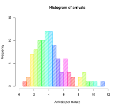
In statistics, a histogram is a graphical representation showing a visual impression of the distribution of data. It is an estimate of the probability distribution of a continuous variable and was first introduced by Karl Pearson.[1] A histogram consists of tabular frequencies, shown as adjacent rectangles, erected over discrete intervals (bins), with an area equal to the frequency of the observations in the interval. The height of a rectangle is also equal to the frequency density of the interval, i.e., the frequency divided by the width of the interval. The total area of the histogram is equal to the number of data. A histogram may also benormalized displaying relative frequencies. It then shows the proportion of cases that fall into each of several categories, with the total area equaling 1. The categories are usually specified as consecutive, non-overlapping intervals of a variable. The categories (intervals) must be adjacent, and often are chosen to be of the same size.[2]
Histograms are used to plot density of data, and often for density estimation: estimating theprobability density function of the underlying variable. The total area of a histogram used for probability density is always normalized to 1. If the length of the intervals on the x-axis are all 1, then a histogram is identical to a relative frequency plot.
An alternative to the histogram is kernel density estimation, which uses a kernel to smooth samples. This will construct a smooth probability density function, which will in general more accurately reflect the underlying variable.
Contents[hide] |
ليست هناك تعليقات:
إرسال تعليق